Brand Refresh
Brand strategy
Website design
Visual identity design
Published Dec 2022
·
3 min read
In a nutshell:
Role: Brand strategy, art direction, copywriting, photography.
We repositioned airfocus from a prioritization and roadmapping platform to a home for products.
Built an new visual identity system
Results
35% increase in average session duration
36% increase in pages per session
4% lower bounce rate.
50M+ views and 100k+ Downloads on Unsplash. Featured in every Website imaginable from Harvard to the NYT, from Mashable to HBR
Multiple people in the industry called it the best website in the product management space. (I disagree, but I think it was up there 😃 )
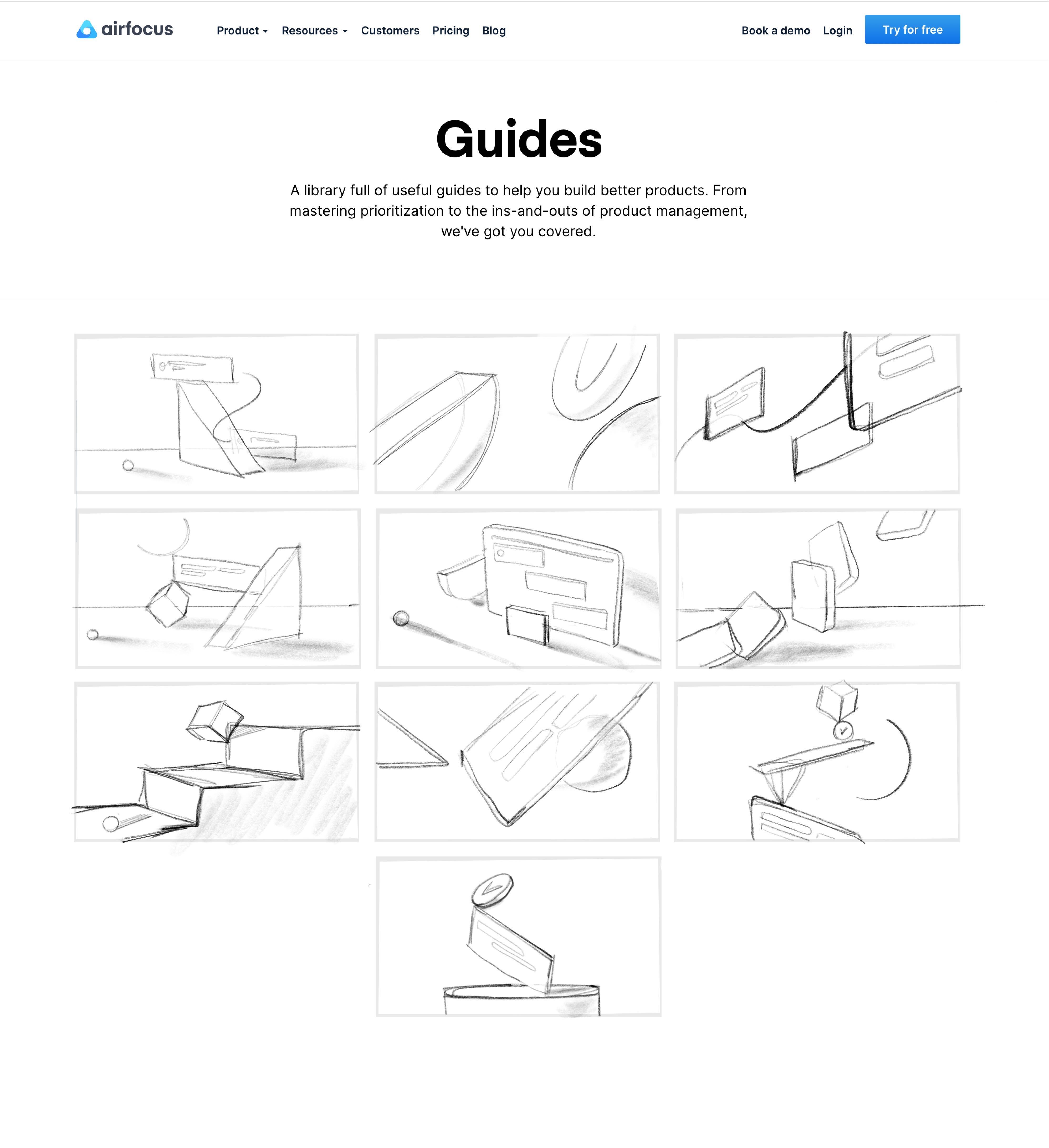
Website
The website already performed on par with industry averages in the standard. It had clear, strong messaging. But the changing value proposition meant that the entire content of the website will have to be overhauled. This gave us an opportunity to fix some of the glaring issues that knew we had:
The website looked decent and was enjoyed by most of our users. But it could benefit from an overall higher quality aesthetic
airfocus had little to no brand identity
The website didn’t have any visual interest. (this is what explain our ability to increase the time spent by a staggering 35%)
Social proof was present but weak

I got a chance to contribute to copy as well. I’m a writer, but not a copywriter. And yet, I wrote a few of our most important pieces of messaging. Here are a few
“Home for products, and the people who build them.” I said this one of the top of my head at the end of a meeting with our CEO. He loved it, it was the H1 of our website for over a year, and is now still used mostly around the company’s mission
“From vision to delivery, your way”. I also said this one off the top of my head. Our CMO loved it. He says it works well when he’s on sales calls. It’s still the H1 on the product page
The new brand identity
I spent months working with Eduardo a 3D designer and animator. it was my first time working with a 3D animator. We happened to pick the most difficult combination to work with: frosted glass in light theme… Never again 😄. We kept getting complements on our hero section. I think it was a success.
We also built a few other animations that tie our benefits to the features. those were simple 2D animations. What’s cool about them was mostly the storyboarding and how much they explain in just a few seconds.
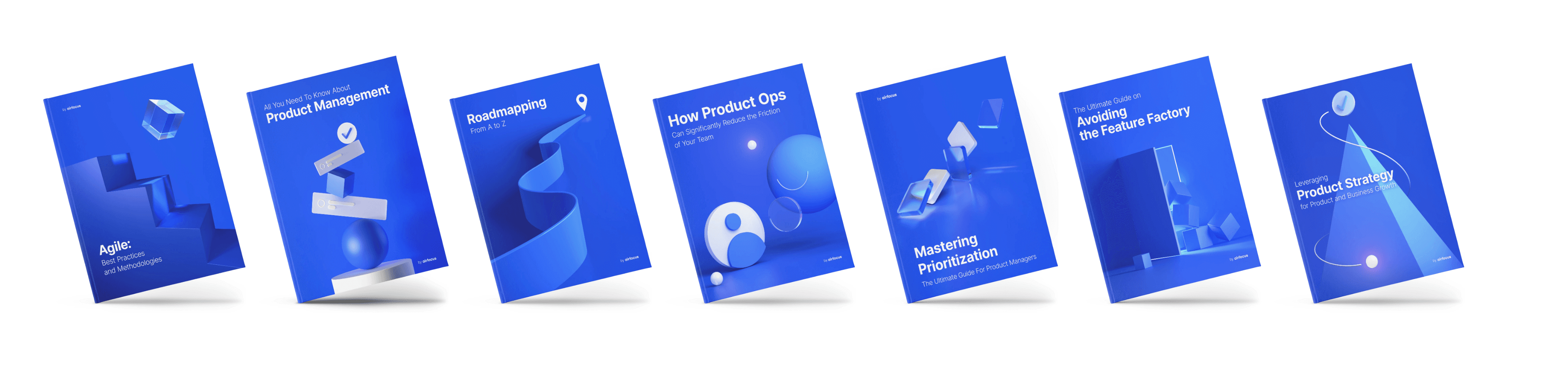
In my last 3 months at airfocus, we finally made a breakthrough with my vision for the visual identity. I hired two new designers who took our 3D visual identity to work and produced amazing looking assets for our collateral.
My vision was that these be used in the app store inside the platform, and to identify templates as well. But they ended up having another use for product marketing. I think they came out looking as good as you can expect. Not quite Microsoft level, but still very pleasing.
Full disclosure: some of these were made after I left.

Evaluation
the airfocus website was the first serious website that I designed at that scale. I’m not really a web designer so I’m overall pleased with the result. I was gunning for a double degit growth in session duration because that’s the only metric that is very relevant to designers. Bounce and conversion can be linked to design, but if they’re high enough, it’s mostly about the traffic that you get. With that said, I was happy with the result.
I didn’t invent any of these techniques, but one of the very early people who caught on to them:
👍🏼 Testimonials on benefit sections rather than in their own section. I benchmarked over 20 industry sites at the time and none was doing that (we have the records, we can check that statement). It is nowadays ubiquitous.
👍🏼Using minurized animations: This was (and still is) also quite a new thing. Some websites use video recordings, some used abstract animations, but the way we did it wasn’t as popular. Essentially, I redrew the UI in a higher density, selecting the items that would scale accordingly and some that woudn’t. This did wonders for our ability to tie the benefits to the features.
👎🏼The website’s visual quality is unimpressive. It has a few nice things but it’s mostly amateurish in my opinion. I now have a much better understanding of spacing and typography and can see just how poor of a web designer I was. So content wise, I’m very happy. Visual wise, I’m quite embarrased of it today (Not that it matters, because it’s barely the same nowadays)
🫰🏻My implementation of Glass and 3D was ok. But it didn’t solve our brand identity issue which was something I warned from in the beginning. That all changed when we hired an in-house 3D designer. We obtained the ability to use 3D effectively. However, that happened after the website was set in stone. So there’s a clear disconnect between the assets(book covers and such) and the website. Today, the disconnect is really unfortunate, but even when I was still in charge, it felt glues together with duct tape. So I think, overall it’s a win because of the quality of the 3D assets that can be used with marketing materials and inside the product, but for the website, it’s an expensive fail.
